
Building a B2B brand and developing a responsive website
Scope of Work
Challenge
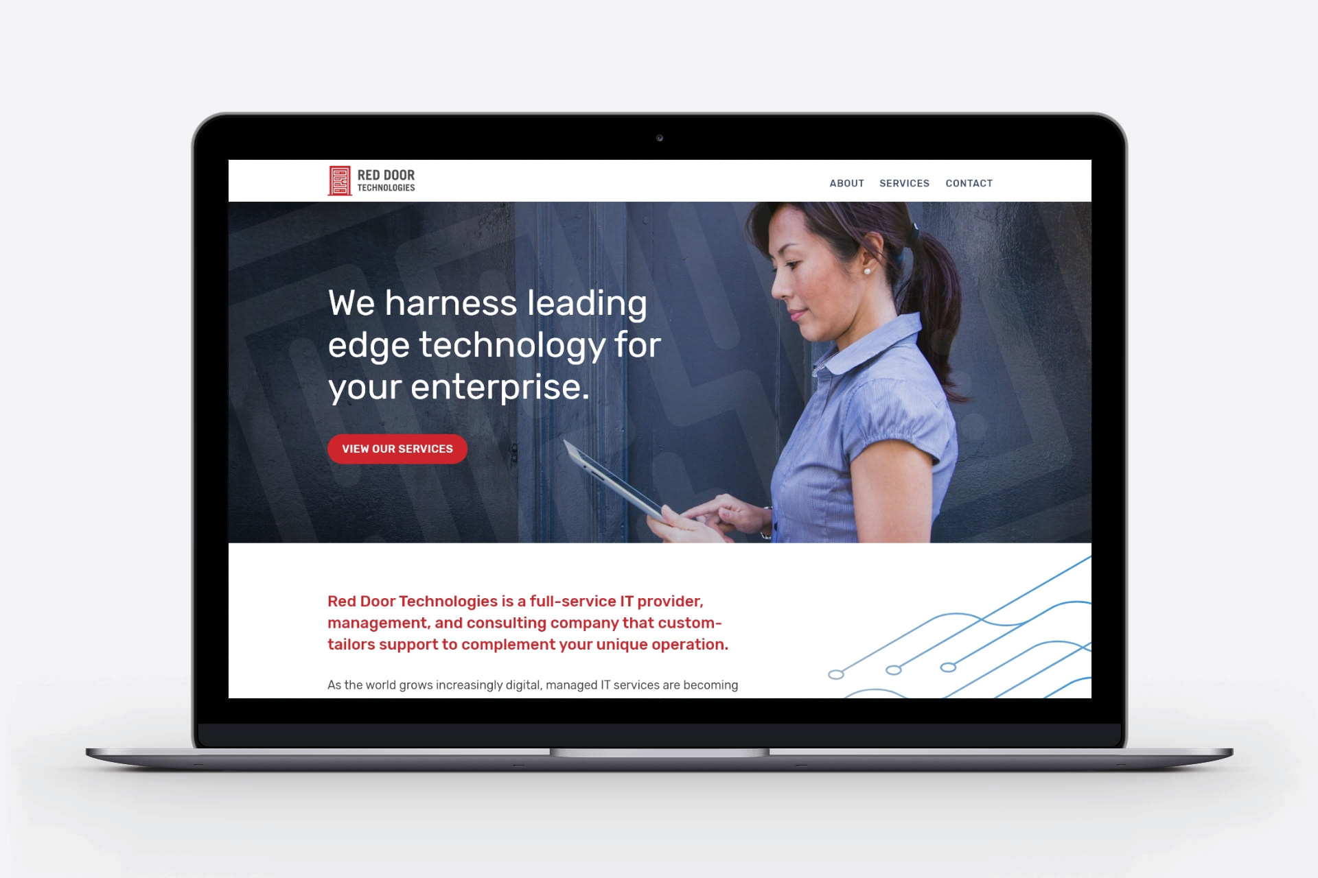
Harnessing Leading-Edge Technology
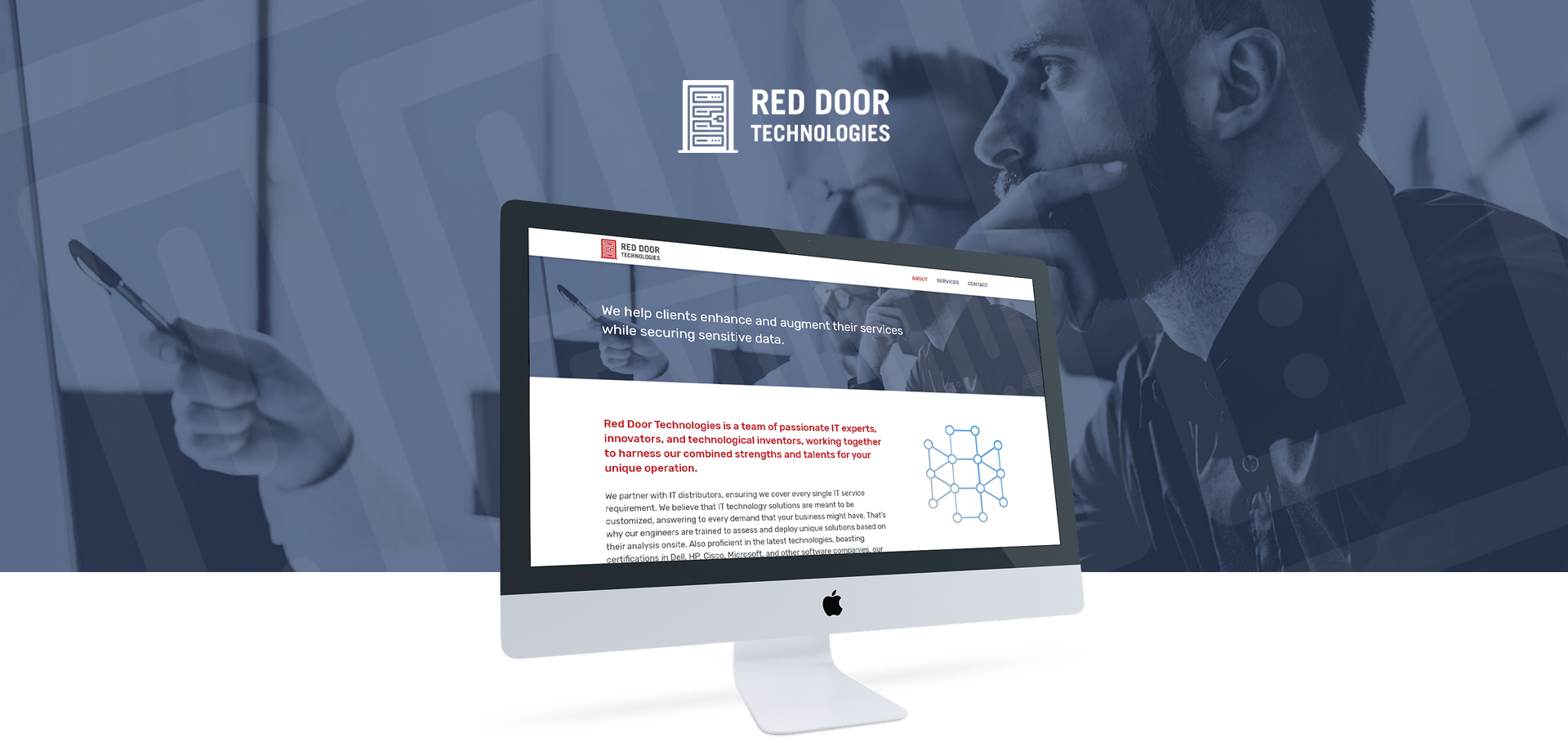
Red Door Technologies, a provider of IT solutions, decided to rebrand when they changed the company name and needed a website and logo. My task was to design their brand identity and build a modern responsive site from concept to launch with the ultimate goal of expanding their marketing and online presence.
The Industry
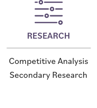
I started with market research and a competitive analysis to gain insight of the IT industry. With my secondary research, the key findings were companies are continuing to move into the cloud and find value from doing so and security is the focus of their single most important current technology project. I also compared industry websites and features for their strengths and weaknesses with a competitive analysis.
Below are some common themes I found:

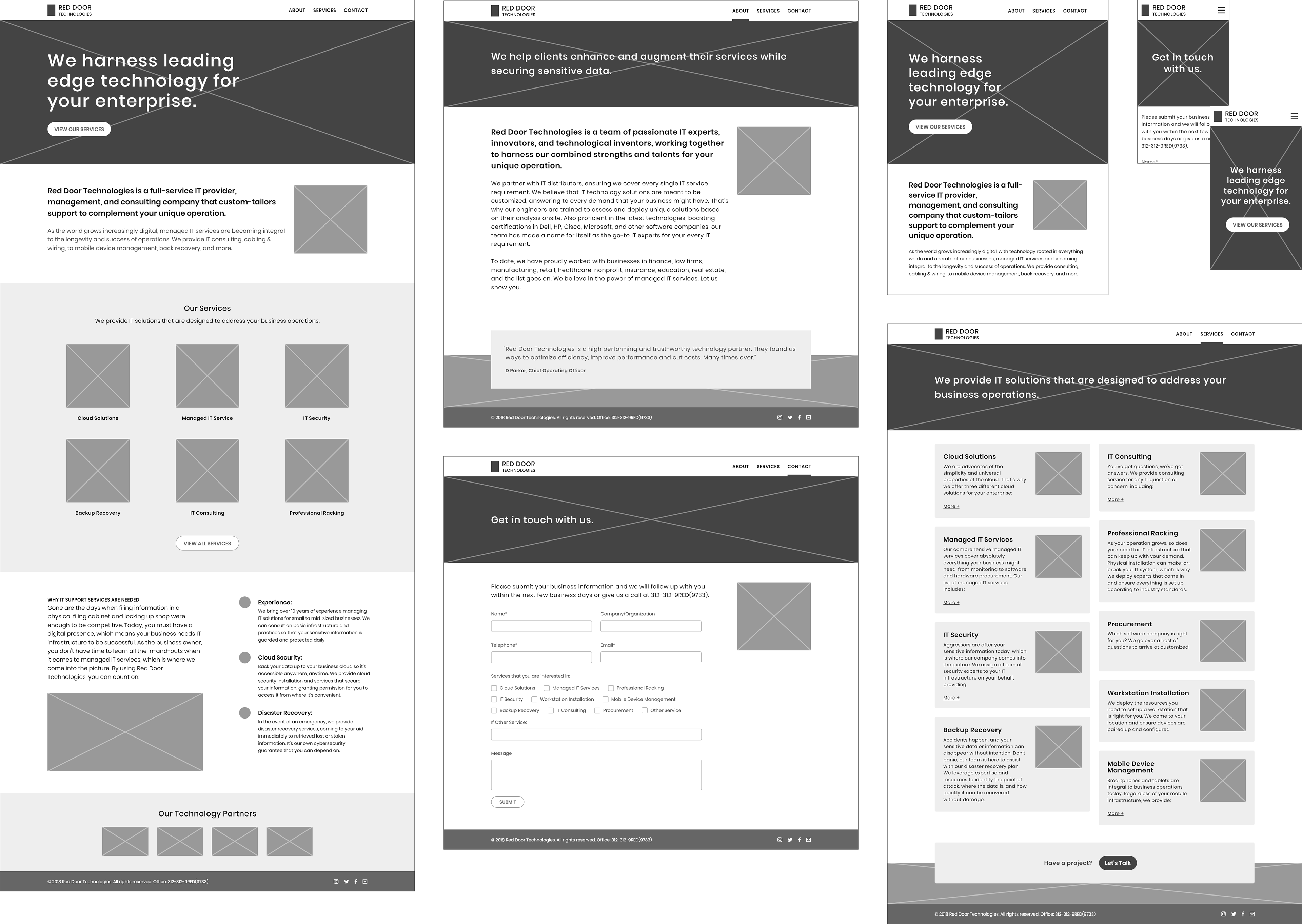
The Blueprint
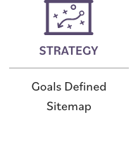
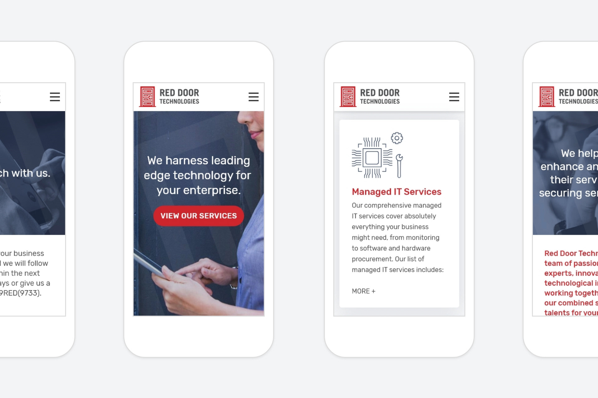
Responsive wireframes were created to quickly map out main content blocks, interface elements and the navigation bar with a 12-column grid structure. While I’m designing, I’m keeping in mind the technical specifications for building it responsively.
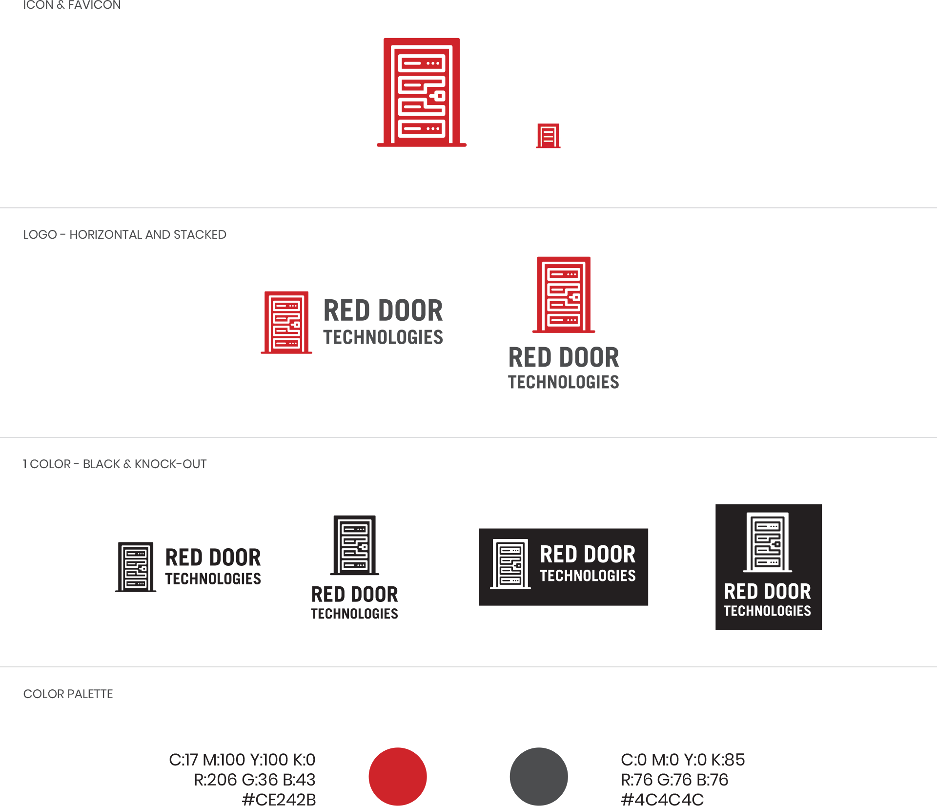
Seeing Red
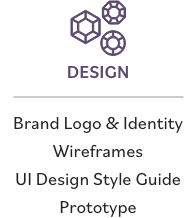
The main requirement for designing the logo was to use the color red. It was an obvious choice with the company's name and a meaningful one because the founder is of Chinese heritage in which color red symbolizes luck and fortune. Combining a red door with technology—it's a no-brainer that the logo with the server rack framed with a red door was selected. I wanted it to be scalable, iconic and have a long-shelf life. This served as building blocks that inspired designs, creating an identity system.
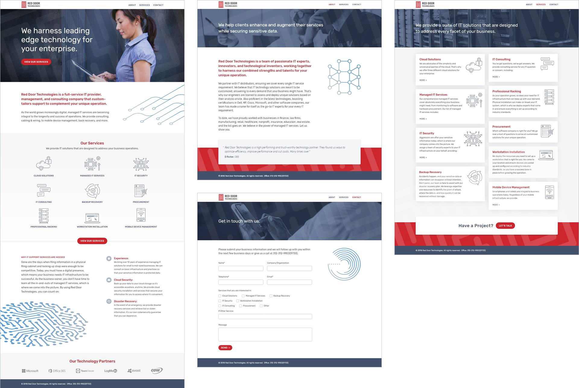
UI Design & Build
I found most competitor sites to have too much content. I wanted to create the opposite and give the site some breathing room, making it easy to scan. Since the site had a limited number of pages, I attempted to make it as visually engaging as possible and incorporate branding elements.
I am a fan of Bootstrap due to its extensive components library and responsive grid system so I used the Bootstrap framework to build a responsive site and customized the CSS along different breakpoints.
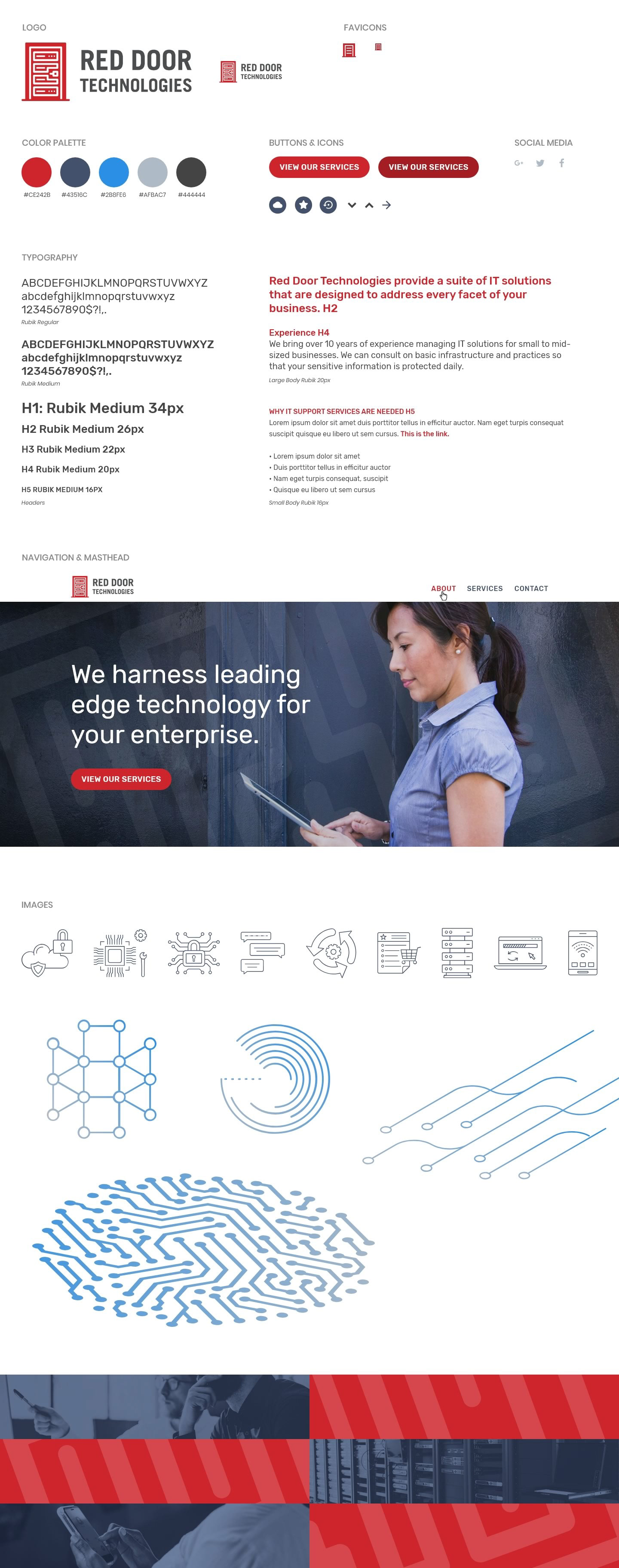
UI STyle Guide
Marketing Brand Touchpoints
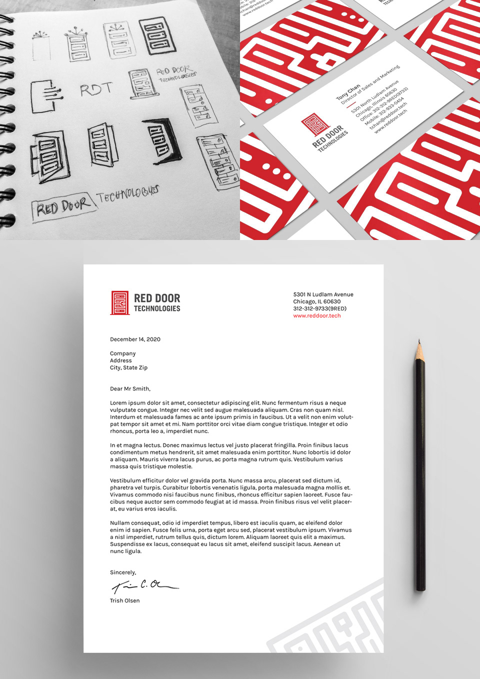
From Sketches to Final Brand Identity
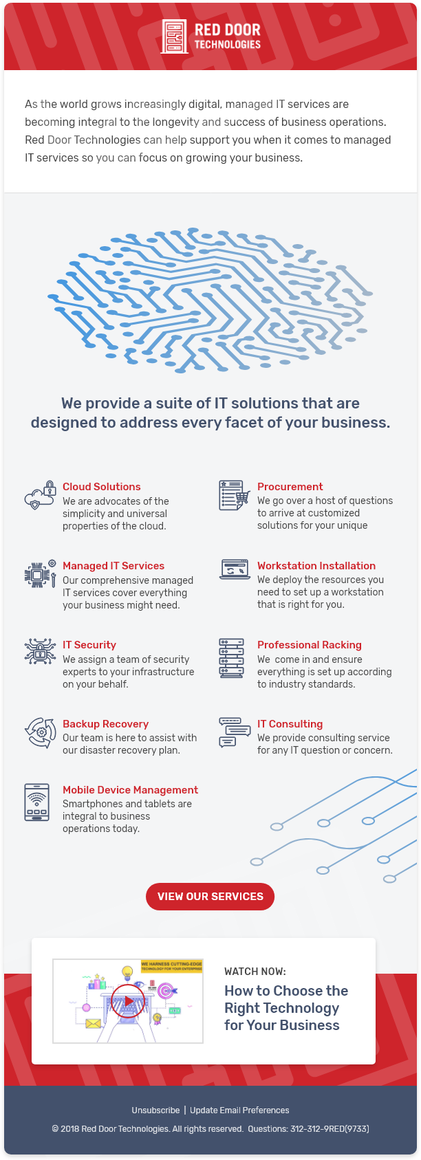
Branded E-Newsletter
In the End
Considering the business perspective was a top priority. Besides making the site's experience better, it was essential that it be a platform to grow an audience, that the client could maintain the site on their own, and have a strong brand presence with a long-shelf life.
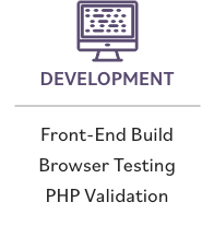
On another note, when I think I have sufficient knowledge and a plan to independently build a simple website, I run into technical challenges and learn something new (e.g. cache purging, combining different classes for grid tiers, and PHP form validations). Every single time. Evidently, technology and methods are always evolving and improving.
“Honestly compared to the other IT sites, ours is great. You’ve done a great job on the site. It’s by far more than I expected and competes with other local IT firms.”
TONY CHAN, CHIEF OPERATING OFFICER
