A thought experiment on designing uncharted territories
Scope of Work


Challenge
Explore Like There's No Tomorrow
ZEIT, a hypothetical venture into time travel tourism, will be the first to make time travel a reality to all and make traveling to the past commercially available and safe. My role was to design a historical yet modern logo and a responsive e-commerce website that is easy to use which allows customers to browse through different trip categories and details, filtering via interests and classifications.
Entering the Unknown
I have entered uncharted territories with time travel to the past. Users have certain expectations using travel sites in the present but outside of that the rules are unwritten.
What would make a compelling experience to motivate people to book their online travels?
How do I present content on how services work in order for users to understand and trust the company?
How do I take the unknown for a service that doesn't exist, on top of one that is like no other?
How do I present content on how services work in order for users to understand and trust the company?
How do I take the unknown for a service that doesn't exist, on top of one that is like no other?
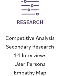
These were some challenges I faced and commenced with market research, a competitive audit, and best practices from all-inclusive tour packages. I spoke with users who often booked their travels online to learn about their motivations, habits, delights and frustrations.
Market Research
Research Findings
The ZEIT Traveler
Research findings and patterns helped create an empathy map, persona, and storyboard to explore the user’s experience and help define goals. This would help lead to conceptualize experiences that resonate with the target audience.
Envisioning the Structure
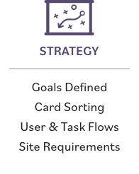
There were several ways of organizing the structure of site. I knew I wanted intuitive classification and it all came down to how I wanted to present and categorize the content based on the number of travel packages.
Design the Interaction
The user flow helped bring understanding on how the user would navigate through the website to accomplish a task. This helped to think about how to optimize a user’s steps with the path of least resistance, what happens before/after they visit a particular page, and possible alternative states.
Userflow with different paths and entry points
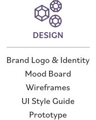
Wireframes were fleshed out main content areas, interface elements and navigation system. Visualizing the structure helped figure out the functionality of certain components. Prior to laying the content on the page, I set up Bootstrap’s 12-column grid structure—my personal choice of framework which I find scalable and flexible.
responsive wireframes
The Ouroboros
My goal was to create a historical yet modern logo, a conceptual design that communicated the brand attributes. I wanted the logo to be flexible—allows for brand growth, iconic, visible when scaled down and able to hold its own with just one color. And so the snake-like, tail-eating “ouroboros” logo emerged—conceptually born from the cyclic restore symbol because it reminded me of an ouroboros and isn’t the past, present and future part of an infinite cycle?
A Dash of Fantastical and Nostalgia
One of the issues I encountered was making it obvious to the user that this was a website for time travel and tourism experience—not a news or history website. It was important that they got it instantly at first glance.
I wanted to add a dash of fantastical to make it convincing and inviting because time travel is a fantasy and associated with what we’ve been exposed to in the media. Imagery selected were ones I felt were iconic, engaging and more readily recognizable of the past. The color palette and design elements are meant to reinforce feelings of nostalgia.
USER INTERFACE Kit
Putting It to the Test
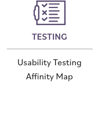
After giving users the task of booking a package, I was able to summarize the results, make any critical changes, and tweak the design. Technically, it went well and they were able to complete the task. Conceptually, there were lots of questions about the reality of the experience which helped me think how I would design it differently given the time such as giving users more confidence to commit to buying by providing details in certain areas.
Final Thoughts
Designing for the unknown was going to be a challenge but a welcomed challenge it was, knowing I would end up with something I could proudly call my own. My biggest hurdle was trying to create a site that was believable and credible—persuading users to put aside their preconceptions about time travel in what they’ve been exposed to in the media and take a leap of faith that anything is possible.
